Introduction to Digital Media Art
Monday, May 7, 2012
Artist Lecture Response – Dr. Ruth Anne Phillips
Tuesday, May 1, 2012
Artist Lecture Response – Dr. Jane Blocker
Wednesday, April 18, 2012
Final Artist Blog Post – Chris Leavens


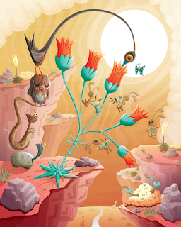
Chris Leavens is a digital media artist born and raised in Pennsylvania. He got his BA in film and video at Penn State University, went out to LA to work in the film industry, but wound up taking an extended break to work as an illustrator, graphic designer, and web designer. He works primarily in Adobe Illustrator to create his outdoor-inspired vector illustrations, which have appeared in art galleries, computer games, books, magazines, TV shows, and feature films. His illustrations create “story-rich artwork [in] surreal landscapes filled with bizarre monsters and fantastical creatures.
When looking at Leavens’ vector artworks, the first thing you take away is just how imaginative the artist is. While some pictures seem to have one underlying story, others have a million things going on at once. It’s no wonder that one of his exhibitions was entitled “Fables and Fairy Tales”. His works also include both fun and whimsical and darker themes. These darker themes include aspects such as one creature consisting of several smaller, creeper critters, or a dark face, frowning and looming overhead. I think Leaven uses this link between lighter subjects and darker aspects mixed throughout to emphasize that there is no pure good or pure evil in the world. Everything is a combination of dark and light. Furthermore, if these artworks are depicting dreams, which in many ways they seem to be, it combines the idea of a pleasant dream with nightmare – both of which everyone has.
The concept behind Chris Leavens’ works is fantastic – mostly because it is actually fantastical. The aesthetic quality is also great because he utilizes shading, gradients, and texture, while adding plenty of tiny detail to every creature as well as all the elements of his landscapes. Correspondingly, he does not leave big blank spaces in the background of his work, but fills up the artboard from edge to edge. Nevertheless, I think what makes Leavens’ work so powerful is the stories they evoke. Because of this I think he could make his work even stronger by creating sets or sequences. He already seems to use a few characters repeatedly in his illustrations, so it would not be too farfetched to unite some of his works in a larger, bigger picture/story that can still be complicated and abstract enough for the viewer to take away their own meaning from. This is about the only thing I can suggest Leavens changes because his work is already so captivating as is.
Artwork and info taken from: http://www.chrisleavens.com/
Also used for info: http://www.smashingmagazine.com/2010/03/04/100-beautiful-illustrator-artworks-by-artists-around-the-world/
Tuesday, April 10, 2012
Nick La

Nick La is a freelance illustrator, CSS web designer, and designer of stock icons. He is the founder of N.Design Studio (where he designs and codes everything himself), Web Designer Wall, Design Jobs on the Wall, Best Web Gallery, and Icondock (a new site exclusively showcasing icons). He prefers to work in vector due to its “scalability and fine stroke” and his preferred tools are Adobe suite’s Photoshop, Illustrator, and Dreamweaver. In fact, his favorite tool in Illustrator is using the Eyedropper and Graphic Styles to apply fill and stroke to many objects at once. While he claims that he likes to explore different aspects of art and culture to see how he can adapt them to his design, his background is Chinese, he likes Chinese and Japanese work, and a lot of his illustration work includes oriental elements.
Looking at his work, I wouldn’t say that Nick La’s illustrations just include oriental elements, but rather that they revolve around them. The subjects of his works range from koi to fans to people, but even when they are people, they are clearly people of Asian descent. Nevertheless, in terms of his web designs, Nick La’s work is more mainstream. He is a good designer in that he knows how to keep his pages interesting without overwhelming the viewer. He is also good at creating layouts that are easy to navigate.
In conjunction with keeping things simple and easy to navigate, La’s icons are great. They’re simple, but fun, and easy to identify. Because of these reasons it’s no wonder that he has been able to create a whole site revolving around them. In his illustrations and web designs he likes to use a variety of color and gradients. These work well in keeping the viewer engaged, but also drawing their eye to important aspects like headings and links. Finally, although the majority of his styles and works are strong and well-planned out, Nick La could work a bit more on drawing his inspiration from things other than Chinese and Japanese culture. It seems that his artistic abilities may be limited by this theme.
Art and Information Sources:
http://vector.tutsplus.com/articles/interviews/interview-with-nick-la/

