Monday, May 7, 2012
Artist Lecture Response – Dr. Ruth Anne Phillips
Tuesday, May 1, 2012
Artist Lecture Response – Dr. Jane Blocker
Wednesday, April 18, 2012
Final Artist Blog Post – Chris Leavens


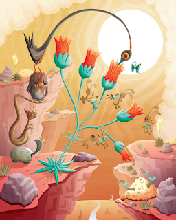
Chris Leavens is a digital media artist born and raised in Pennsylvania. He got his BA in film and video at Penn State University, went out to LA to work in the film industry, but wound up taking an extended break to work as an illustrator, graphic designer, and web designer. He works primarily in Adobe Illustrator to create his outdoor-inspired vector illustrations, which have appeared in art galleries, computer games, books, magazines, TV shows, and feature films. His illustrations create “story-rich artwork [in] surreal landscapes filled with bizarre monsters and fantastical creatures.
When looking at Leavens’ vector artworks, the first thing you take away is just how imaginative the artist is. While some pictures seem to have one underlying story, others have a million things going on at once. It’s no wonder that one of his exhibitions was entitled “Fables and Fairy Tales”. His works also include both fun and whimsical and darker themes. These darker themes include aspects such as one creature consisting of several smaller, creeper critters, or a dark face, frowning and looming overhead. I think Leaven uses this link between lighter subjects and darker aspects mixed throughout to emphasize that there is no pure good or pure evil in the world. Everything is a combination of dark and light. Furthermore, if these artworks are depicting dreams, which in many ways they seem to be, it combines the idea of a pleasant dream with nightmare – both of which everyone has.
The concept behind Chris Leavens’ works is fantastic – mostly because it is actually fantastical. The aesthetic quality is also great because he utilizes shading, gradients, and texture, while adding plenty of tiny detail to every creature as well as all the elements of his landscapes. Correspondingly, he does not leave big blank spaces in the background of his work, but fills up the artboard from edge to edge. Nevertheless, I think what makes Leavens’ work so powerful is the stories they evoke. Because of this I think he could make his work even stronger by creating sets or sequences. He already seems to use a few characters repeatedly in his illustrations, so it would not be too farfetched to unite some of his works in a larger, bigger picture/story that can still be complicated and abstract enough for the viewer to take away their own meaning from. This is about the only thing I can suggest Leavens changes because his work is already so captivating as is.
Artwork and info taken from: http://www.chrisleavens.com/
Also used for info: http://www.smashingmagazine.com/2010/03/04/100-beautiful-illustrator-artworks-by-artists-around-the-world/
Tuesday, April 10, 2012
Nick La

Nick La is a freelance illustrator, CSS web designer, and designer of stock icons. He is the founder of N.Design Studio (where he designs and codes everything himself), Web Designer Wall, Design Jobs on the Wall, Best Web Gallery, and Icondock (a new site exclusively showcasing icons). He prefers to work in vector due to its “scalability and fine stroke” and his preferred tools are Adobe suite’s Photoshop, Illustrator, and Dreamweaver. In fact, his favorite tool in Illustrator is using the Eyedropper and Graphic Styles to apply fill and stroke to many objects at once. While he claims that he likes to explore different aspects of art and culture to see how he can adapt them to his design, his background is Chinese, he likes Chinese and Japanese work, and a lot of his illustration work includes oriental elements.
Looking at his work, I wouldn’t say that Nick La’s illustrations just include oriental elements, but rather that they revolve around them. The subjects of his works range from koi to fans to people, but even when they are people, they are clearly people of Asian descent. Nevertheless, in terms of his web designs, Nick La’s work is more mainstream. He is a good designer in that he knows how to keep his pages interesting without overwhelming the viewer. He is also good at creating layouts that are easy to navigate.
In conjunction with keeping things simple and easy to navigate, La’s icons are great. They’re simple, but fun, and easy to identify. Because of these reasons it’s no wonder that he has been able to create a whole site revolving around them. In his illustrations and web designs he likes to use a variety of color and gradients. These work well in keeping the viewer engaged, but also drawing their eye to important aspects like headings and links. Finally, although the majority of his styles and works are strong and well-planned out, Nick La could work a bit more on drawing his inspiration from things other than Chinese and Japanese culture. It seems that his artistic abilities may be limited by this theme.
Art and Information Sources:
http://vector.tutsplus.com/articles/interviews/interview-with-nick-la/
Wednesday, March 28, 2012
Monday, March 26, 2012
Wednesday, March 7, 2012
Monday, March 5, 2012
Alan Bigelow

Alan Bigelow is a web artist whose Flash works, utilizing image, text, audio, and other components, convey messages about our society. He is said to be a poet and digital fiction writer.
One of his works, “Because You Asked” (http://www.webyarns.com/BecauseYouAsked.html), is an interactive self-portrait of the artist. When the viewer first views the piece they see a light blue backdrop where a face should be, and icons at the bottom of the screen, such as a golf ball and a pill. When the viewer clicks on these icons, sentences start to appear that fill in the backdrop with a color picture of Bigelow’s face. These sentences depend upon the icon selected. For example, when the pill icon is selected, the viewer gets the response of “Sex is my favorite drug.” Then, each sentence does not only continue to duplicate itself all over Bigelow’s face visually, but is also played on an audio loop. The more icons selected, the more sentences are spoken and written over one another. Finally, once the self-portrait is complete, the viewer’s curser turns into an eraser, wiping away Bigelow’s face and leaving only the words “Because you asked.”
First, this piece speaks to what a self-portrait consists of in current times with not just an image, but audio, text, and an interactive element as well. A self-portrait is no longer two-dimensional. It is also no longer up to the artist alone to create their work. Other people must interact and take part in the process… despite the fact that it is a “self-portrait”. Then, at the end, by turning the curser into an eraser to leave nothing but “because you asked”, Bigelow seems to say this portrait was not just made for the viewer, but only because the viewer was interested. On another note, he also emphasizes how easily he, and everything that he is made up of, can be erased.
In another one of his works entitled “What They Said” (http://www.webyarns.com/WhatTheySaid.html), the viewer is presented with what looks like an old television or radio with an adjustable dial at the bottom. Moving the dial along to different stations, several static-filled messages appear. Two of these messages are, “we must register our identities to keep them safe” and “freedom of speech is not free”. Without question these are comments on the problems and perplexities of the world we live in today. It leaves the viewer thinking, “well, isn’t that ironic.”
In terms of a critique, the audio portions of Alan Bigelow’s works are very harsh. In “Because You Asked” the voice was overly computerized and monotone. I understand that this is supposed to further convey that we are in the digital age, but I felt it a bit overdone. Also, in “What They Said” I felt that the static was not needed for the stations that conveyed messages, but instead should have only been used between stations. It made me not want to wait around to watch/hear the end of each message. Conversely, I felt that the text portions of Bigelow’s works were the strongest. They were outspoken (“sex is my favorite drug”) and conveyed powerful messages (“freedom of speech is not free”).
More of Alan Bigelow’s work can be found at: http://www.webyarns.com/
Information for this post was collected from:
http://rhizome.org/artbase/artwork/47096/
http://rhizome.org/profiles/alanbigelow/
… as well as those mentioned in text.
Image taken from:
Wednesday, February 29, 2012
Monday, February 27, 2012
MGM Logo Redone
Logo to Change
Wednesday, February 22, 2012
Monday, February 20, 2012
Sunday, February 19, 2012
Some Logos
 Retrieved from: http://www.humorsoffice.com/lists/10-hidden-messages-logos/
Retrieved from: http://famous-logos.blogspot.com/2009/11/famous-logo-success-stories.html

Retrieved from: http://www.webdesignerdepot.com/2009/03/40-excellent-logos-created-with-helvetica/
 Retrieved from: http://unrealitymag.com/wp-content/uploads/2010/12/smart_logos_that_640_19.jpg
Monday, February 6, 2012
Wednesday, February 1, 2012
Tuesday, January 31, 2012
Lumarca

To create Lumarca, Albert Hwang and Matt Parker developed software that allows the input of 3D information, including motion, to be transported through a computer out through a 3D volumetric display. Because the entire system only requires a computer, projector, and some materials found at most hardware stores, it has been described as “an affordable platform for artists to design compelling content that conveys information, narrative, and aesthetic information in a new way”.
http://www.youtube.com/watch?v=YeyMaYgj1DI&feature=player_embedded#!
The video above shows how Lumarca can be used to scan a field of vision that includes a person into the computer and then project this through the display. Matt Parker, the narrator of the film, describes how seeing this volumetric display of one's own body can really make the viewer feel as if they’re having an out of body experience. Then, he further explains the uniqueness of the project as a whole due to the ability to view the projections without 3D glasses.
When thinking about Parker’s point that viewing Lumarca properly does not entail wearing glasses or any other headwear, I began to realize how much more “real” this aspect makes the projection. Without something physically on your head reminding you that what you’re seeing is not as tangible as it seems, the display crosses into a different realm of 3D projection (while remarkably staying on that affordable platform). Furthermore, because of its ability to mimic the body parts and movement of a person as well as simpler objects and dynamics such as a wave or a ball, it was understandable why the display was so engaging. As soon as I watched the video I found myself imagining what it would be like to manipulate how the projection was moving and what it looked like. I feel that this aspect of the project is actually the most important because it makes Lumarca not only a creation of the designers, but of the interacting subject as well.
Finally, although I could see the image of Parker’s body moving around in the projection during the demonstration in the video, it seemed very disjointed, whereas another Lumarca projection of a sphere looked a lot smoother. Maybe this was due to the size of the input or simply the amount of detail, but I found myself wishing the more complex projections looked as neat as the simpler ones I had viewed earlier. Also, while the example of a sphere was shaded to help show dimension, the separation of body parts such as legs, torso, arms, and head in the body was created by using different colors for each. I felt this could be improved upon as well in some of the projections.
Original work and photo found at: https://www.eyebeam.org/projects/lumarca
Video found at: http://www.madparker.com/lumarca/


